Bringing the Great
Western Railway to life
CONCEPT • UX/UI • PITCH TEAM
Great Western Rail has grown into one of the most important railway networks in the West of England. They approached us with the challenge to create a digital product that engaged their customers, helped them attract new customers and made them stand out in a massively competitive market.
Business Requirement
Build an engaging brand showcase. Give travellers a different angle to travel, make them thrilled to get on-board with GWR.
Customer Demand
Make my journey interesting and memorable.
Goals and objectives
Taking Part in stand ups, client meetings and retrospectives.
Ensuring that creative strategy and UX had a voice throughout the project.
Wireframing, prototyping and presentation deck design.
My role
Considerations
Target Audience: Leisure travellers with the Great Western Railway.
Key constraints: Unpaid pitch work with limited time and resource.
Research findings: Mobile web stats show that iOS is by far the pre-dominant operating system for GWR passengers.

Great Western Stories
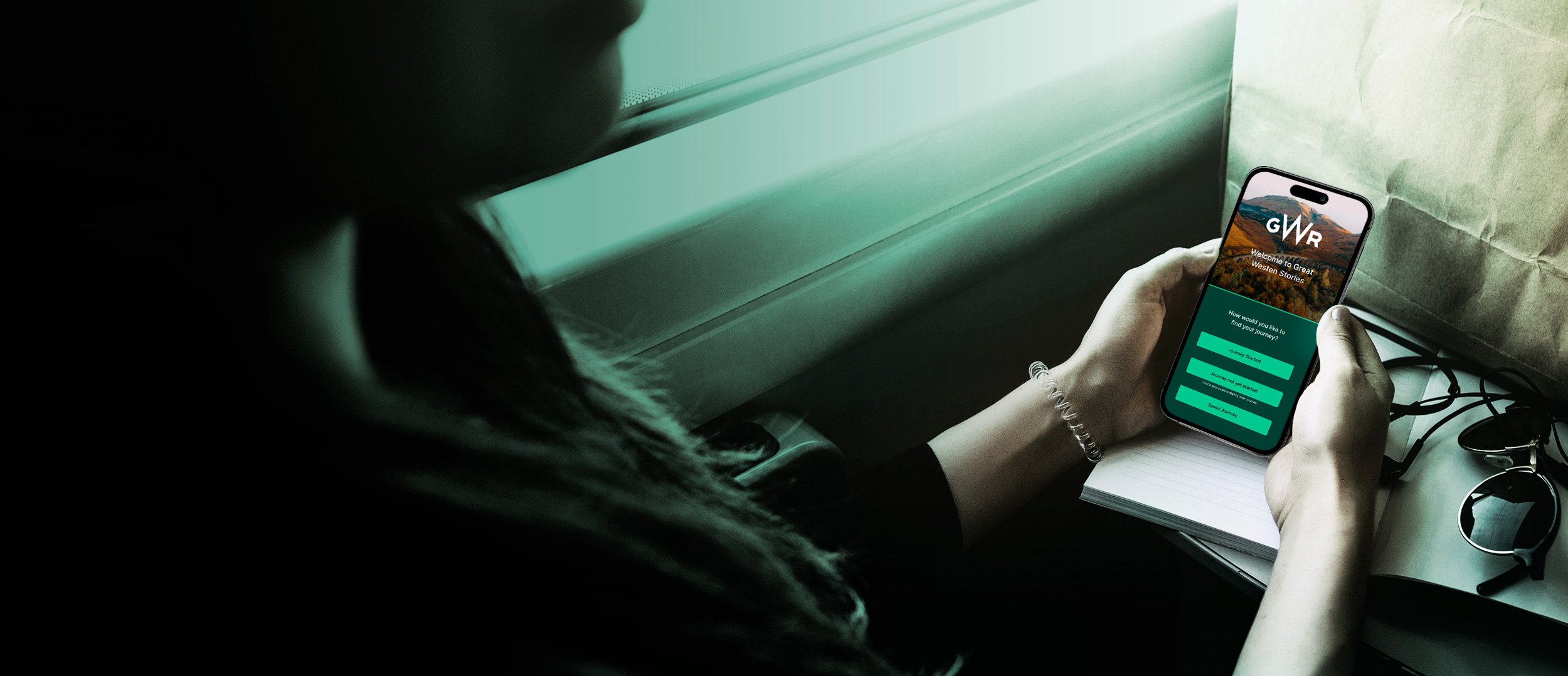
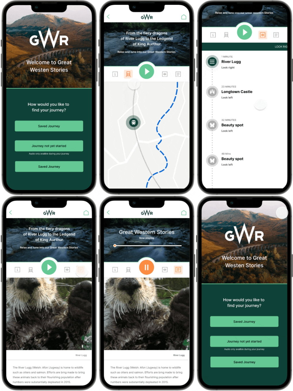
A journey companion app that delivers entertaining local stories, triggered to play at the right time as and when you pass through the area where the story unfolds.
Concept
The GWR journey companion app is a window into the lives of the South West, its community, history and landscape both past and present. Delivering, revealing and entertaining stories of local Legends, Royal rulers and wild swimming.
While the story plays out in the background the app also:
Allows travellers to keep up to date with information about their train/journey.
Ensures that each story starts at the corresponding location (GPS tracker).
Has successional audio tracks, providing a smooth and flowing experience.
Provides indications on location of point of interest based on the train’s geo-location.
Gives users a glimpse of their journey prior to departure via moderated user generated imagery.
Has iBeacons installed on trains for the purpose of publicity.
Concept and mechanic
Rapid paper wireframes were created and discussed with the technical development team, so decisions around technical feasibility and scoping could be addressed.
Developing low-fidelity wireframes were effective in revealing design flaws, they also allowed us to test the experience internally, highlighting any further room for improvement.
Creating a sticker sheet made the design process quicker and ensured continuity across screens.
The UX process
High fidelity wireframes
Hi-fidelity prototypes provided the client with a very clear picture of the end result, these were presented at the pitch meeting.
High fidelity wireframes and prototypes
Addressed accessibility needs in the initial design process and designed with this in mind.


